Nowadays, People surf your website on a various devices as mobile/tablet has become a significant part of our daily life. Responsive design makes website adaptive across at various devices.
Since Liferay 6.1 does not provide responsiveness functionality by default, we have to achieve this manually. I prefer Bootstrap 2.3.2 library to achieve this functionality as Liferay 6.2 uses it.
Basic requirements are as follow to start the theme development.
Basic Requirements :
Download Twitter Bootstrap 2.3.2 library from following link.
http://getbootstrap.com/2.3.2/assets/bootstrap.zip
We required following things from downloaded bundle.
Minified version:
CSS
JS
Theme creation:
Here, I am creating a sample responsive theme.
-
Open IDE(Eclipse/Liferay Developer Studio). Go to File -> New -> Liferay Plugin Project.
Make the following selections:
Select Next
--> Choose parent theme (_styled / _unstyled / classic). As for now select classic as a parent theme.
--> Choose Theme Framework (Freemarker / Velocity / jsp).
--> Click on Finish.
Theme directory structure:
-
The _diffs folder must mirror the parent theme’s directory structure.
-
Add bootstrap.min.js under _diffs --> js directory.
-
Add bootstrap.min.css and bootstrap-responsive.min.css under _diffs --> css directory.
-
Add your custom css under _diffs --> css directory for as per the requirements.
-
Copy main.css from Liferay-Responsive-theme --> css directory and paste in Liferay-Responsive-theme --> _diffs --> css.
-
Now Import bootstrap and custom css in main.css as follows.
main.css
@import url(base.css);
@import url(application.css);
@import url(layout.css);
@import url(dockbar.css);
@import url(navigation.css);
@import url(portlet.css);
@import url(forms.css);
@import url(extras.css);
@import url(custom.css);
/* *** Bootstrap css *** */
@import url(bootstrap.min.css);
@import url(bootstrap-responsive.min.css);
/* *** custom css *** */
@import url(theme.css);
/* *** custom responsive css *** */
@import url(responsive.css);
-
Add following css in your custom css(theme.css).
#wrapper{min-width:90%;max-width:90%;}
Note : Change value accordingly your requirements.
-
Deploy theme using command ant clean deploy.
Responsive layout (optional):
-
Responsive-1-2-1-columns-layout.tpl file would be as follow.
<div class="columns-1-2-1" id="main-content" role="main">
<div class="portlet-layout row-fluid">
<div class="portlet-column portlet-column-only span12" id="column-1">
$processor.processColumn("column-1", "portlet-column-content portlet-column-content-only")
</div>
</div>
<div class="portlet-layout row-fluid">
<div class="portlet-column portlet-column-first span6" id="column-2">
$processor.processColumn("column-2", "portlet-column-content portlet-column-content-first")
</div>
<div class="portlet-column portlet-column-last span6" id="column-3">
$processor.processColumn("column-3", "portlet-column-content portlet-column-content-last")
</div>
</div>
<div class="portlet-layout row-fluid">
<div class="portlet-column portlet-column-only span12" id="column-1">
$processor.processColumn("column-1", "portlet-column-content portlet-column-content-only")
</div>
</div>
</div>
-
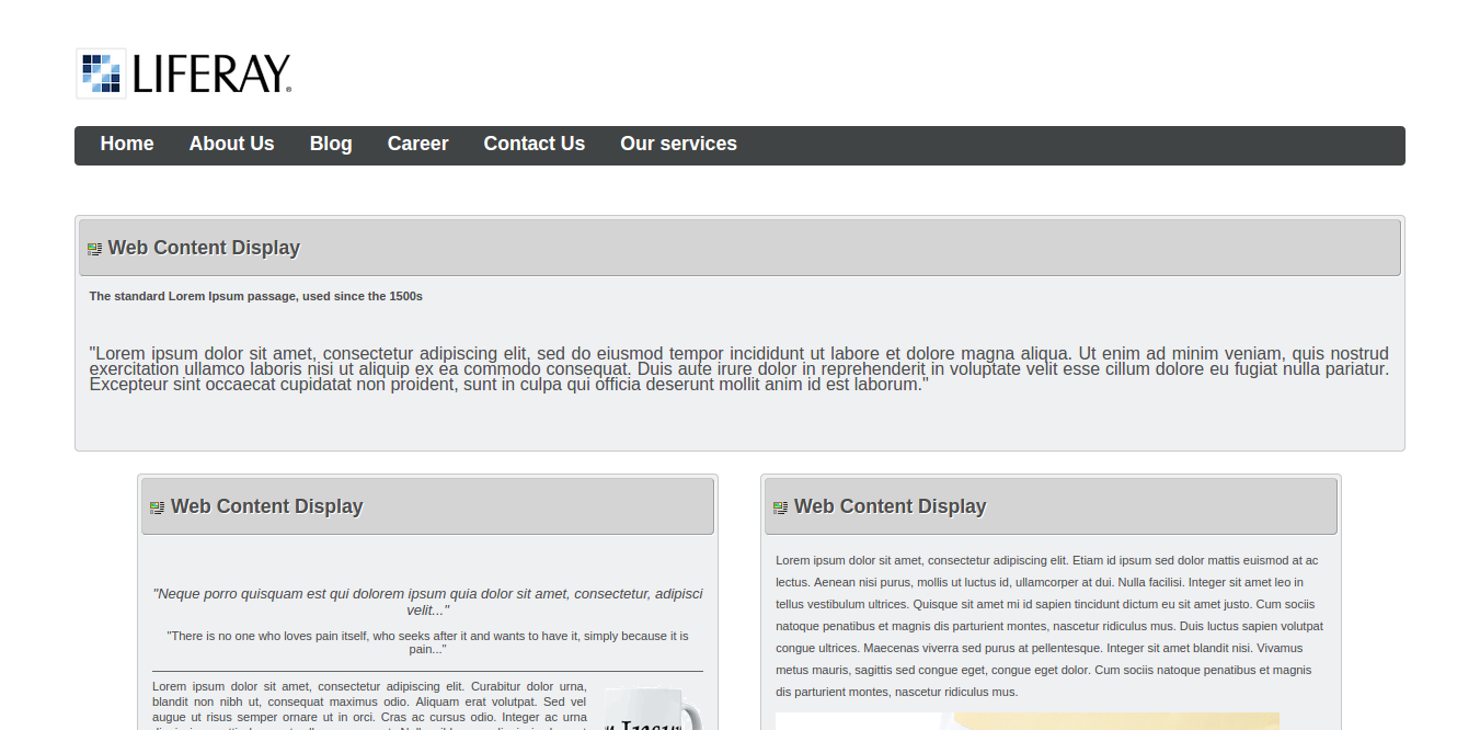
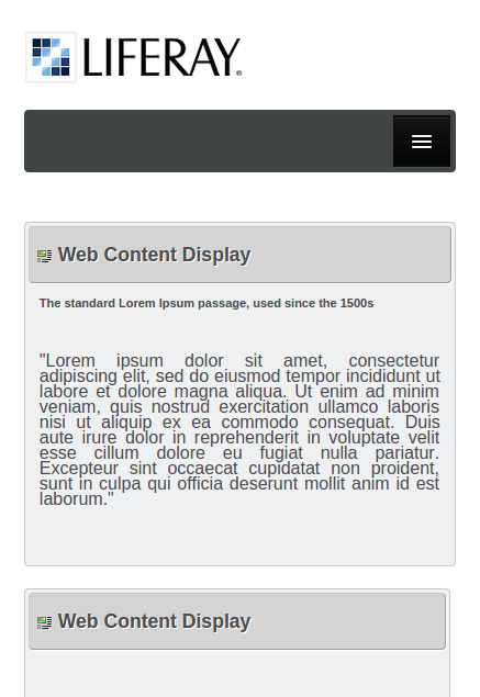
Your theme will look like as shown in the following screenshots:
Desktop View :
Mobile View:
Download sample theme war from below link :
For professional paid support, you may contact us at [email protected] .

