Objective
In this blog, we will learn how to create a custom component in Adobe Experience Manager (AEM). Custom components in AEM allow developers to meet requirements where AEM’s out-of-the-box components are not sufficient to fulfil the needs.
By the end of this blog, you will have a solid understanding of how to create a custom component in AEM, successfully deploy it on an AEM instance, and configure it on a page.
Prerequisite
- AEM 6.5 Local Development Environment
- Basic Understanding of AEM
- Basic understanding of AEM component structure
- Maven Archetype AEM Project
What is Custom Component
A custom component in AEM is a reusable building block that extends the functionality of standard AEM components. It allows developers to create experiences by defining their own UI, logic, and configurations while seamlessly integrating with AEM's content management capabilities.
Key Advantages of Custom Component in AEM
- Flexibility - Custom components allow developers to create layouts that meet specific business and design requirements.
- Reusability - Once created, custom components can be reused across multiple pages and projects, reducing development time and effort.
- Better Content Authoring Experience - Custom components can be designed to provide a more user-friendly experience for content authors.
Steps to Create Custom Component in AEM
Step 1 : Define Component Definition
- Navigate to the ui.apps module of your project, then navigate to /app/staemdemo/components (Remember staemdemo is our site name).
- Create a folder named industry-section under the components folder and inside that folder create a file named “content.xml” with following.
    <?xml version="1.0" encoding="UTF-8"?>
    <jcr:root xmlns:cq="http://www.day.com/jcr/cq/1.0" xmlns:jcr="http://www.jcp.org/jcr/1.0"
    jcr:primaryType="cq:Component"
    jcr:title="Industry Section"
    componentGroup="ST AEM DEMO - Content"/>
Let’s understand the properties of component definition file (.content.xml) .
- jcr:primaryType="cq:Component" property describes that node type is a Component.
- jcr:title = “Industry Section” property describes the label of the component.
- ComponentGroup = “ST AEM DEMO – Content"
The ComponentGroup property categorizes the component in the AEM component palette. When content authors want to add the component to a page, they can find it under a specific group.
Step 2 : Define Dialog for the Authoring
- Under the industry-section folder, create another folder named _cq_dialog.
- Under the _cq_dialog folder create a file named .content.xml and populate it with the following:
		<?xml version="1.0" encoding="UTF-8"?>
<jcr:root xmlns:sling="http://sling.apache.org/jcr/sling/1.0" xmlns:cq="http://www.day.com/jcr/cq/1.0" xmlns:jcr="http://www.jcp.org/jcr/1.0" xmlns:nt="http://www.jcp.org/jcr/nt/1.0"
    jcr:primaryType="nt:unstructured"
    jcr:title="Properties"
    sling:resourceType="cq/gui/components/authoring/dialog">
    <content
        jcr:primaryType="nt:unstructured"
        sling:resourceType="granite/ui/components/coral/foundation/fixedcolumns">
        <items jcr:primaryType="nt:unstructured">
            <container
                jcr:primaryType="nt:unstructured"
                sling:resourceType="granite/ui/components/coral/foundation/container">
                <items jcr:primaryType="nt:unstructured">
                    <tabs
                        jcr:primaryType="nt:unstructured"
                        sling:resourceType="granite/ui/components/coral/foundation/tabs"
                        maximized="{Boolean}true">
                        <items jcr:primaryType="nt:unstructured">
                            <general
                                jcr:primaryType="nt:unstructured"
                                jcr:title="General"
                                sling:resourceType="granite/ui/components/coral/foundation/fixedcolumns"
                                margin="{Boolean}true">
                                <items jcr:primaryType="nt:unstructured">
                                    <container
                                        jcr:primaryType="nt:unstructured"
                                        sling:resourceType="granite/ui/components/coral/foundation/container">
                                        <items jcr:primaryType="nt:unstructured">
                                            <title
                                                jcr:primaryType="nt:unstructured"
                                                sling:resourceType="granite/ui/components/coral/foundation/form/textfield"
                                                fieldLabel="Title"
                                                name="./title"/>
                                            <descryption
                                                jcr:primaryType="nt:unstructured"
                                                sling:resourceType="granite/ui/components/coral/foundation/form/textfield"
                                                fieldLabel="Descryption"
                                                name="./descryption"/>
                                            <industry
                                                jcr:primaryType="nt:unstructured"
                                                sling:resourceType="granite/ui/components/coral/foundation/form/multifield"
                                                composite="{Boolean}true"
                                                fieldLabel="Industry">
                                                <field
                                                    jcr:primaryType="nt:unstructured"
                                                    sling:resourceType="granite/ui/components/coral/foundation/container"
                                                    name="./industryCard">
                                                    <items jcr:primaryType="nt:unstructured">
                                                        <column
                                                            jcr:primaryType="nt:unstructured"
                                                            sling:resourceType="granite/ui/components/coral/foundation/container">
                                                            <items jcr:primaryType="nt:unstructured">
                                                                <title
                                                                    jcr:primaryType="nt:unstructured"
                                                                    sling:resourceType="granite/ui/components/coral/foundation/form/textfield"
                                                                    fieldLabel="Title"
                                                                    name="./cardTitle"/>
                                                                <descryption
                                                                    jcr:primaryType="nt:unstructured"
                                                                    sling:resourceType="granite/ui/components/coral/foundation/form/textfield"
                                                                    fieldLabel="Descryption"
                                                                    name="./cardDescryption"/>
                                                                <linkURL
                                                                    jcr:primaryType="nt:unstructured"
                                                                    sling:resourceType="granite/ui/components/foundation/form/pathbrowser"
                                                                    fieldLabel="Link to"
                                                                    name="./linkURL"
                                                                    rootPath="/content"/>
                                                                <altText
                                                                    jcr:primaryType="nt:unstructured"
                                                                    sling:resourceType="granite/ui/components/foundation/form/textfield"
                                                                    fieldLabel="Alt Text"
                                                                    name="./altText"/>
                                                                <redirectionLink
                                                                    jcr:primaryType="nt:unstructured"
                                                                    sling:resourceType="granite/ui/components/foundation/form/textfield"
                                                                    fieldLabel="Redirection Link"
                                                                    name="./redirectionLink"/>
                                                            </items>
                                                        </column>
                                                    </items>
                                                </field>
                                            </industry>
                                        </items>
                                    </container>
                                </items>
                            </general>
                        </items>
                    </tabs>
                </items>
            </container>
        </items>
    </content>
    <success-story/>
</jcr:root>
The above XML file generates a dialog for the Custom Component. The critical part of the file is the inner nodes that are used for authoring the values. Later on this dialog will be mapped with Sling model to expose the values of the of each properties via JSON model.

Step 3 : Define Sling Model
A Sling Model is essentially a Java POJO (Plain Old Java Object) class used to map data from the JCR (Java Content Repository) to a Java object. This allows us to retrieve content from the repository and make it available for rendering in the component's HTML.
- Create a Java class under the core module of your project. This class will be used to represent the component's data.
- Annotate the class with @Model: The @Model annotation tells AEM that this class is a Sling Model, which can be adapted from a Resource and injected with properties from the JCR.
package com.st.aem.demo.core.models;
import java.util.List;

import javax.inject.Inject;
import javax.inject.Named;

import org.apache.sling.api.resource.Resource;
import org.apache.sling.models.annotations.DefaultInjectionStrategy;
import org.apache.sling.models.annotations.Model;
import org.apache.sling.models.annotations.injectorspecific.ChildResource;

@Model(adaptables = Resource.class, defaultInjectionStrategy = DefaultInjectionStrategy.OPTIONAL)
public class IndustriesSectionModel{

    @ChildResource
    @Named("industryCard")
    private List<Resource> industryCard;

    @Inject
    String title;

    @Inject
    String descryption;

    public List<Resource> getIndustryCard() {
        return industryCard;
    }

    public String getTitle() {
        return title;
    }

    public String getDescryption() {
        return descryption;
    }
}

}
Explanation of Sling Model
- @Model: This annotation tells AEM that this class is a Sling Model. The adaptables = Resource.class part indicates that the class can be adapted from an AEM Resource, which refers to a node in the JCR.
- @Inject: The @Inject annotation is used to inject values from the JCR into the fields of the model. In this case, we are injecting the title and description fields.
- @ChildResource: The @ChildResource annotation is used to fetch child resources. In this example, we are fetching a list of industryCard resources under the "industryCard" name. This means that the industryCard field will hold a list of child nodes that are nested under the industryCard property in your JCR.
- DefaultInjectionStrategy.OPTIONAL: This means that if any property or resource is missing in the JCR, AEM will not throw an error but instead inject a null value. We can change this to REQUIRED if we want to enforce the presence of these properties.
Step 4: Rendering the Component using HTL (HTML Template Language)
After defining the Sling Model and dialog, you can now render the content in your HTL file (formerly known as Sightly). The HTL file is responsible for displaying the content on the page.
- Inside the industry-section folder, add a file industry-section.html, which is responsible for the HTML presentation of the component. Naming the file the same as the folder is important, as it becomes the default script Sling uses to render this resource type.
- Add the following code to industry-section.html
    <section class="st-container st-industry-section" data-sly-use.model="com.st.aem.demo.core.models.IndustriesSectionModel">
    <div>
        <div class="section-header medium-space text-center">
            <h2>${model.title}</h2>
            <p>${model.descryption}</p>
        </div>
    </div>
    <div class="container slider-container">
        <div class="st-industries-wrapper">
            <div class="row mx-xl-n2 mx-0 suite-of-industry">
                <sly data-sly-list.industryCard="${model.industryCard}">
                    <div class="col-xl-3 col-12 px-xl-2 px-0">
                        <div class="st-industry-item">
                            <img src="${industryCard.valueMap.linkURL}" alt="${industryCard.valueMap.altText}"
                                class="st-industry-thumbnail" width="404" height="404">
                            <div class="st-industry-item-dic">
                                <h5>${industryCard.valueMap.cardTitle}</h5>
                                <p>${industryCard.valueMap.cardDescryption}</p>
                                <a href="${industryCard.valueMap.redirectionLink}" class="st-arrow-read-btn"><span>Read More</span> <img
                                        src="/content/dam/staemdemo/home/common-images/right-orange-arrow.svg" alt="right-orange-arrow"
                                        class="st-read-more-white" width="15" height="15"></a>
                            </div>
                        </div>
                    </div>
                </sly>
            </div>
        </div>
    </div>
</section>
Explanation of HTL Script
- data-sly-use.model="com.st.aem.demo.core.models.IndustriesSectionModel" : This is an HTL directive that binds the IndustriesSectionModel Sling Model to the HTL script. We can access the injected value directly using model, such as ${model.title}
- data-sly-list.industryCard="${model.industryCard}" : This is HTL list directive used to iterate over a collection of items. If you look at the file created for cq_dialog under cq_dialog/.content.xml and look for the node named industryCard, it has several child nodes under it such as linkURL, altText and redirectionLink. And in sling mode as well we have annotated it with @childResource with List type of variable.
We are accessing each childResource value of industryCard using valueMap, for example we are accessing the linkURL as ${industryCard.valueMap.linkURL} for displaying the authored image.
Step 5: Deploy the Project
- Open Terminal/Command Prompt: Navigate to your AEM project directory where your pom.xml file is located.
- Execute the Command: Run the following Maven command to build and deploy the project to AEM:
mvn clean install -PautoInstallSinglePackage
Step 6: Add Custom Component in template policy
In Adobe Experience Manager (AEM), if you want to allow a custom component to be used on a page, you need to enable it through the Template Policy before it can be used in a page template. The Template Policy is a mechanism to control which components are available for use in a particular page template, ensuring that only authorized components are added to a template.
Open the page on which you want to use the custom component and open the template of that page as shown in below image.
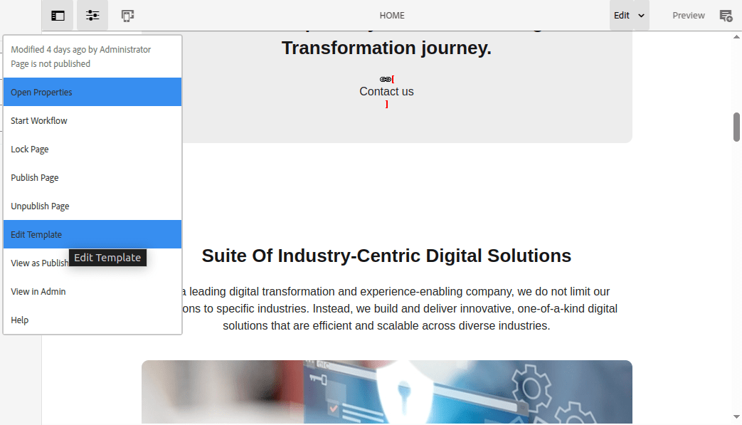
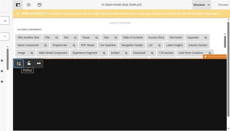
Click on page policy.
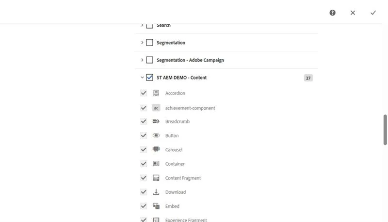
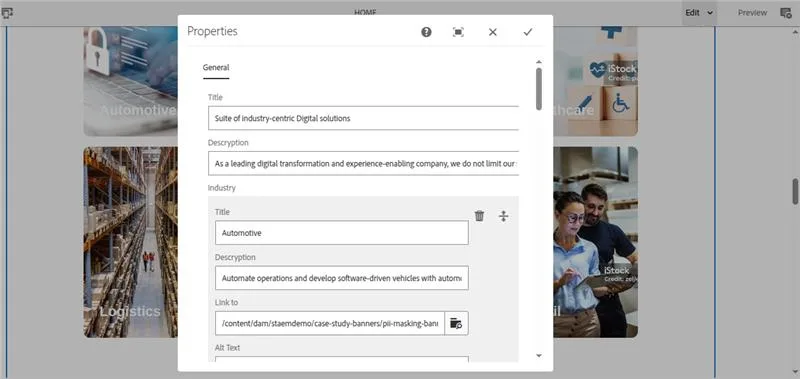
From the allowed components tab, there will be list of all the component and we need to find our component group which is “ST AEM DEMO – Content" and inside that there will be our component “Industry Section” we need to enable it.

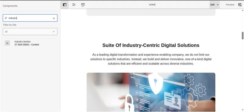
Step 7: Use Custom Component on a page and Author the content
Open page in edit mode on which you want to use your custom component and search for the custom component by its name, in our case its industry section as shown in below image.
Drag and drop it to our page and open the Dialog for the content authoring as shown in below image.
Final Output: Industry Section Component

Conclusion
Creating a custom component in Adobe Experience Manager (AEM) enables developers to build personalized, reusable, and content-author-friendly components. In this blog, we walked through the complete lifecycle of building a custom component, from defining the component and dialog to implementing a Sling Model, rendering with HTL, and deploying it to AEM.
Ready to elevate your digital experience with AEM? At Surekha Technologies, we bring proven expertise as a leading AEM development company in India. Whether you’re looking to hire skilled AEM developers or need end-to-end AEM implementation support, we deliver solutions that are fast, scalable, and future-ready. Let’s build exceptional digital experiences together >>> contact us today!


