Are you a react developer? And seeing a marvelous alternative similar to chrome developer tools for inspecting and trying different designs from a designer perspective. Then the Storybook is here for you.
Storybooks make your life easier by creating independent components. Storybook is a user interface development environment and playground for UI components.
Storybook runs outside your react application without worrying about the business logic and works in an isolation environment.
Why Should You Learn it?
Let’s assume the team is working on react application, which things make works smoother:
- Ability to view the different component that has already been developed as part of the application
- Ability to view the what are the different props that these developed component accept
- Ability to visually showcase those components to your stakeholders for feedback
- Dynamically change props and immediately see the changes in UI without having to move back and forth between the browser and your editor
Storybook will help you with all of these.
Storybook not only supports react but it also supports Angular, Vue, Ember, etc. you can check on their official site. (Link)
Setup your first story:
Now, Let’s start coding :
Step 1: By the following command Create your react application:
- npx create-react-app my-app
Step 2: Install storybook into your application:
It looks like a simple command but it does lots of things behind the scenes. It will look at your dependencies and provide you with the best configuration available.
Step 3: Run storybook
- npm run storybook or
- yarn storybook
Changes that storybook does in your project :
- Storybooks only used in the development, so all dependencies storybooks install its the dev dependencies
- It will add two scripts to the package. JSON file, one to run storybook on dev mode and the other to build it for production.
- The third change is the addition of the default storybook configuration on the root directory of your application. In that two files are there, preview.js and main.js
main.js: Export an object with two properties, stories, and add-ons. The first one is stories that indicate that in the source folder stories that end with some extensions specified have to be treated as stories for our storybook app. And the second one is add-ons which are entries for add-ons that we are installing.
Preview.js: Contains configuration for your stories
- The final change is they added some boilerplate code for you to start.
Storybook has lots of features that are impossible to cover in a single blog, we will write our first story using storybook.
Storybook is basically a collection of stories and each story represents a single visual state of a component.
Here for the demo purpose, I will write a story for a button component.
Now as part of the story writing process we need to have three main files:
- First Write Button Component it selfs
- Second is the style related to the button component
- Finally the story corresponding to the button component
It’s a good idea to write all three files in a single folder:
Button Component : (Button.js)
import React from 'react'
import './Button.css'

function Button (props) {
    const { variant = 'primary', children, ...rest } = props
    return (
        <button className={`button ${variant}`} {...rest}>
         {children}
        </button>
    )
}

export default Button;
Button Styles : (Button.css)
.button {
    border: none;
    color: white;
    padding: 15px 32px;
    text-align: center;
    text-decoration: none;
    display: inline-block;
    font-size: 16px;
    border-radius: 4px;
    cursor: pointer;
}

.primary {background-color: #008CBA;} /* Blue */
.secondary {background-color: #e7e7e7; color: black;} /* Gray */
.success {background-color: #4CAF50;} /* Green */
.danger {background-color: #f44336;} /* Red */
Button Story : (Button.stories.js)
- Import button component, and write story for the button format is called the component story format
- It has one default export and one or more name exports
- In Default export title is mandatory and it should be unique in the entire project. This tile is displayed on the left side of the storybook’s navigation panel.
- Every named export in this file represent a story
- The menu item is created as a button title in the storybook for each of the named exports.
- We can check how our component looks in different variations
import React from 'react'
import Button from './Button'

export default {
    title: 'Form/Button',
    component: Button,
}

export const Primary = () => <Button variant='primary'>Primary</Button>
export const Secondary = () => <Button variant='secondary'>Secondary</Button>
export const Success = () => <Button variant='success'>Success</Button>
export const Danger = () => <Button variant='danger'>Danger</Button>
Run the command:
- npm run storybook or yarn storybook
The output looks like this:
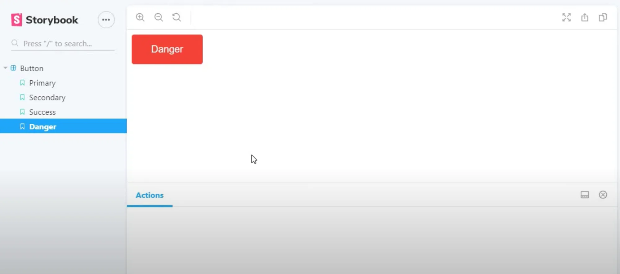
So, When you run the command ‘yarn storybook’, the Command goes to the main.js file to check the pattern and pick up the appropriate stories. We have such file button.stories.js, then it picks up that file. Here the code reads the default export and adds an entry in the side navigation, and then it picks up named exports and renders actual components.
All these come together in the storybook app for us to visualize the component.


