Introduction
“Data” is a core component that is used for decision making in any business. Decision making becomes easier if you have a graphical/pictorial representation of your data in order to analyze it efficiently. A chart is a most suitable concept to represent the data in the required format. In Liferay digital platform it was difficult so far to implement the charts in the portal. You have to either create your custom portlet using JFreeChart or Google Charts or use third-party API. Latest release of Liferay 7.1 comes up with the powerful set of taglibs for creating commonly used UI components in your apps. One of them is Chart taglib that is used to create a different chart to visualize data. Liferay 7.1 support Clay which is Liferay’s web implementation of Lexicon experience language that takes care of web application’s UI. One of the Lexicon core components is charts. So you can now directly use Charts in your portal with inbuilt functionalities by using react or soy portlet. Let’s see in detail how you can use charts in Liferay.
How to use charts in Liferay
Liferay 7.1 comes up with the Clay which indeed supports components for Charts. It supports various flavors of charts and variety of chart attributes for the detailing in charts. Different type of charts supported which are as mentioned below:
- Bar Charts
- Line Charts
- Scatter Charts
- Spline Charts
- Step Charts
- Combination Charts
- Donut Charts
- Gauge Charts
- Pie Charts
- Geomap Charts
- Predictive Charts
Liferay provides chart taglib to support the chart ( clay component ). Clay will take care of few of the initial configurations to display Chart on UI. Chart taglib provides attributes to specify the chart configurations and other attributes. Chart taglib declaration is as shown below:
<%@ taglib prefix="chart" uri="http://liferay.com/tld/chart" %>
By using chart taglib you can add a chart to be displayed on the UI of web application. Chart taglib have the attribute named config which accepts the chart model object of the specified chart type. Example for the bar chart taglib is as shown below:
<chart:bar config="<%=chartSampleDisplayContext.getBarChartConfig()%>" id="bar" />
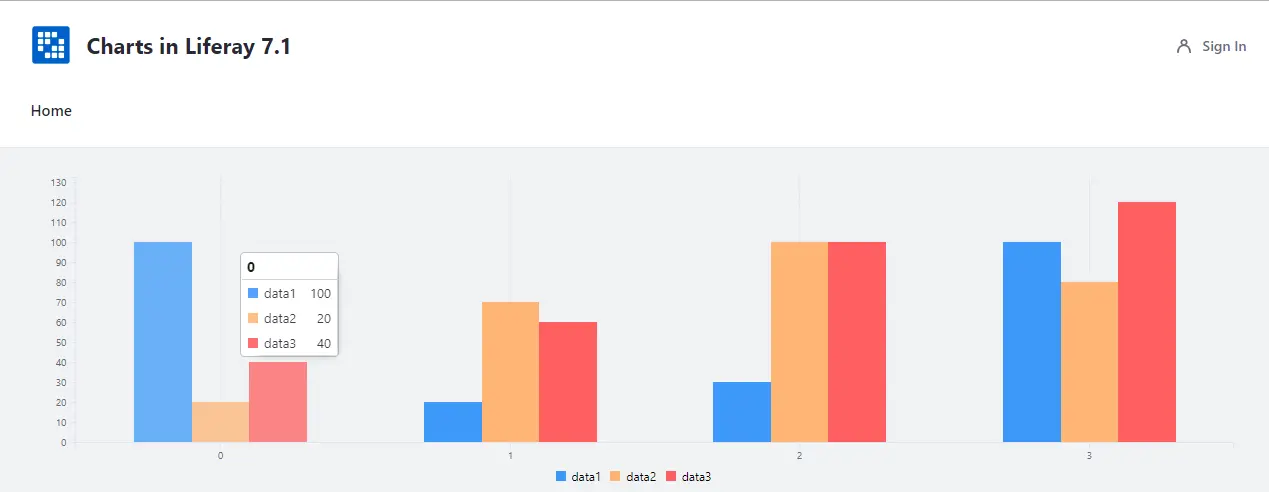
Now lets see how one can create chart model object and set it as a value for the config attribute. In the case of bar chart you can use MultiValueColumn model as a value to display multiple data in the bar chart format. Example for the creating bar chart model object is as shown below:
_barChartConfig.addColumns(new MultiValueColumn("data1", 100, 20, 30, 100), new MultiValueColumn("data2", 20, 70, 100, 80), new MultiValueColumn("data3", 40, 60, 100, 120));
Example

BAR CHART

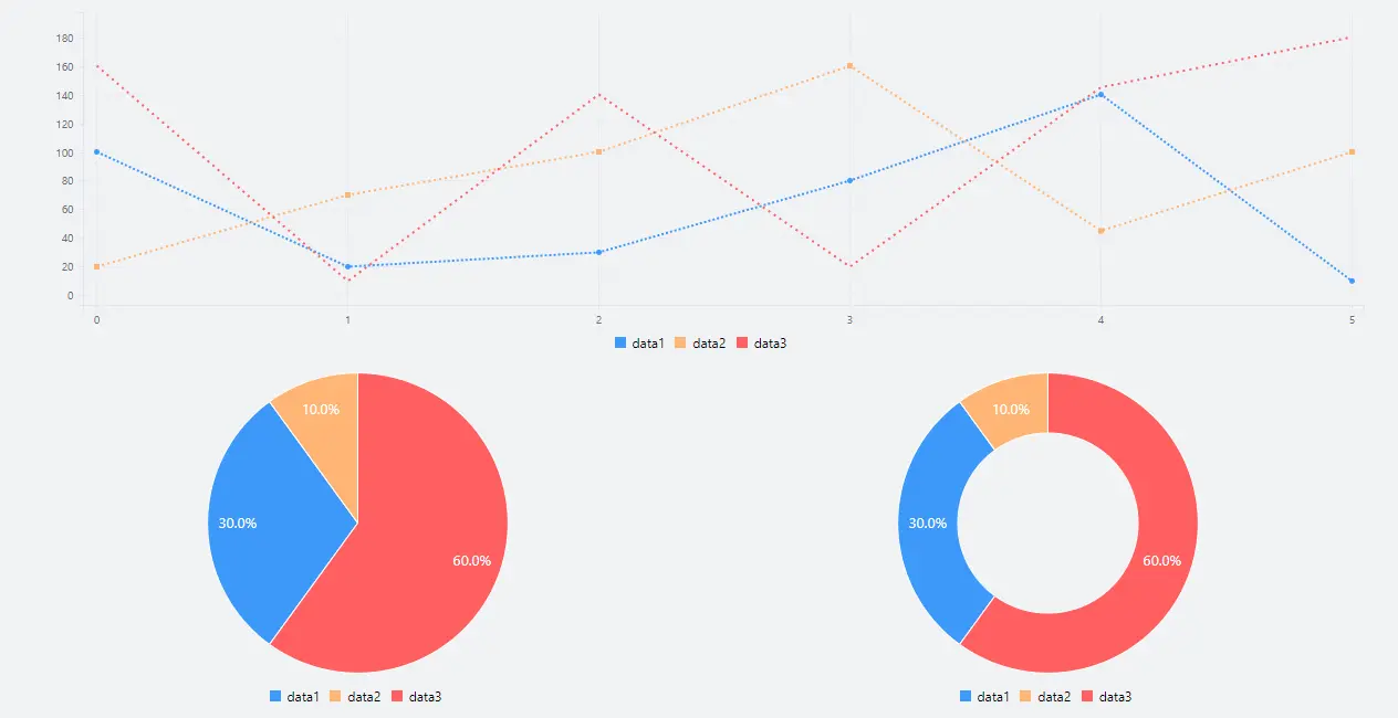
LINE CHART, PIE CHART & DONUT CHART

COMBINATION CHART
Additional Reading
You can explore the other features of Liferay 7.1 by going through our blog New features of Liferay 7.1


