The OWL Notification Service Overview
The OWL Notification Service is an integral part of the Odoo interface, designed to capture the user's attention effectively. Positioned in the top right corner, it leverages a prime visual area that users frequently glance at, ensuring that critical messages are not overlooked. This feature is particularly useful for delivering various types of messages, such as:
- Alerts : Immediate notifications about system errors, security issues, or urgent updates that require the user's prompt attention.
- Warnings : Cautionary messages that inform users about potential issues or actions that might have unintended consequences, helping to prevent mistakes.
- Information : General updates, reminders, or confirmations that keep users informed about system status, upcoming events, or changes in workflow.
Customization Options
The OWL Notification Service is highly customizable, allowing administrators to tailor notifications to meet their organization's specific needs. Customization options include:
- Appearance : Notifications can be color-coded to indicate their nature (e.g., red for errors, yellow for warnings, green for success messages) and can include icons or other visual elements to enhance clarity.
- Duration : Administrators can set how long notifications remain visible on the screen.
- Behavior : Notifications can include custom buttons with event handlers for specific actions when clicked.
Integration with Odoo Modules
The notification system can be integrated with various modules within Odoo, ensuring that relevant information is disseminated across different functional areas such as sales, inventory, accounting, and human resources. This integration helps maintain a cohesive and informed user base, ultimately contributing to smoother operations and better decision-making.
It has a very simple syntax to understand:
import { useService } from "@web/core/utils/hooks";

this.notification = useService("notification")

this.notification.add("message",options={})
In this way we can create our custom notification, for more details refer the example shown below:
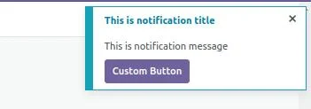
notification.add("This is notification message", {

title: "This is notification title",

type: "info",

className: "",

// sticky:true // To hide notification manually

// buttons:[

// {

// name:"Test Button",

// onClick:()=>{

// console.log("Test btn clicked")

// },

// primary:"true"

// },

// ]

})
Message Displayed in the Notification Box:
The first line of the notification configuration will contain the actual message that you want to display to the user. This message is the main content of the notification and should be concise yet informative. For example, it could be a reminder, an alert, or a piece of information that the user needs to see.
Example : "This is a notification message"
Title of the Notification:
The title is a brief heading that appears at the top of the notification. It provides a quick context or summary of what the notification is about. The title should be short and to the point, making it easy for the user to understand the purpose of the notification immediately.
Example: "Upload Complete"
Type of Notification:
The type of notification typically defines the color and sometimes the icon associated with the notification. Different types are used to convey different levels of urgency or categories of information. Common types include:
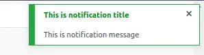
- success - Usually green, indicating that an operation was completed successfully.
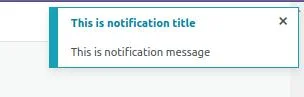
- info - Usually blue, providing general information that is not critical.
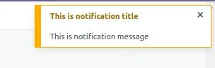
- warning - Usually yellow or orange, indicating a potential issue that the user should be aware of.
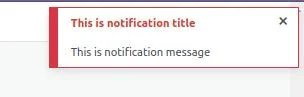
- danger - Usually red, indicating that something went wrong.
And we have other options
- remains on the screen until the user clicks the cross button to dismiss it.

- custom buttons can be included within the notification, each having custom click event handlers to perform specific actions when clicked.
Conclusion:
The OWL Notification Service in Odoo 17 is a powerful tool designed to deliver important information prominently and effectively. Through Odoo customization and integrating notifications across different modules, administrators can ensure that users are promptly informed about critical updates, alerts, and warnings, enhancing the user experience and supporting efficient decision-making.
Implementing the OWL Notification Service can significantly improve communication within your Odoo system, ensuring that essential messages are delivered and acknowledged promptly.


