Objective
The goal of this blog is to help developers understand how they can integrate a React application as a custom component in Adobe Experience Manager (AEM). By following a step-by-step approach, we will learn how to embed a React app into an AEM component.
Why Use React in AEM?
While AEM provides HTL (Sightly) and Java backend support, integrating React offers:
- Better user experience with fast, dynamic interfaces.
- Reusability and maintainability of frontend logic.
- Ability to use modern JavaScript tooling and state management.
Prerequisites
Before we begin, make sure you have the following in place:
- AEM 6.5 Local Development Environment.
- Basic Understanding of AEM.
- Understanding of How to Create Custom Component.
- Node.js 12.22 and npm 6.14 installed for React development.
- Maven 3.6 installed on your machine.
Step 1: Generate the AEM Project with react as frontend
To get started, you need to generate an AEM SPA project and set frontendModule = react as show in below.
Enter the below command in terminal to initiate the AEM SPA project.
    mvn -B org.apache.maven.plugins:maven-archetype-plugin:3.2.1:generate \

    -D archetypeGroupId=com.adobe.aem \

    -D archetypeArtifactId=aem-project-archetype \

    -D archetypeVersion=35 \

    -D appTitle="WKND SPA React" \

    -D appId="wknd-spa-react" \

    -D artifactId="aem-guides-wknd-spa.react" \

    -D groupId="com.adobe.aem.guides.wkndspa.react" \

    -D frontendModule="react" \

    -D aemVersion="6.5.5"
Notice the frontendModule=react property. This tells the AEM Project Archetype to bootstrap the project with a starter React code base to be used with the AEM SPA. Properties like appTitle, appId, artifactId, and groupId are used to identify the project and purpose.
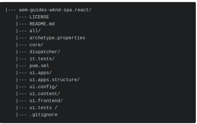
The following project structure will be generated by the Maven archetype on your local file system:
Step 2: Customizing the index.js Application
The module we’ll be focusing on is the ui.frontend module, which is entirely Node-based. This module serves as the entry point for our React application, primarily through the App.js and index.js files.
import 'react-app-polyfill/stable';
import 'react-app-polyfill/ie9';
import 'custom-event-polyfill';

import React from 'react';
import { createRoot } from 'react-dom/client';

import App from './App';
import './components/import-components';
import './index.css';

class ReactAppWebComponent extends HTMLElement {
    connectedCallback() {
        if (!this.root) {
            const root = createRoot(this);
            root.render(
                <App />
            );
            this.root = root;
        }
    }

    disconnectedCallback() {
        if (this.root) {
            this.root.unmount();
        }
    }
}

const ELEMENT_ID = "react-app-component";
if (!customElements.get(ELEMENT_ID)) {
    customElements.define(ELEMENT_ID, ReactAppWebComponent);
}
- The WebComponent class, which extends the HTMLElement class, is responsible for handling actions when the custom React element is inserted into the Custom Component.

Step 3: Customizing the App.js Application
When we generate an AEM project using the archetype with frontendModule=react, it generates a basic React structure for us, including an App.js file.
By default, this App.js is generated for editable components in AEM. However, for our custom use case, we need to update this file to reflect our actual application structure.
In our example, we've modified App.js to include a Navbar, Sidebar, and multiple Card components using React Bootstrap for layout and styling. Here’s what our customized App.js looks like:
import { withModel } from '@adobe/aem-react-editable-components';

import React from 'react';

import Navbar from './components/Navbar/Navbar';
import Sidebar from './components/Sidebar/Sidebar';
import Card from './components/Card/Card';

import Row from 'react-bootstrap/Row';
import Col from 'react-bootstrap/Col';

// This component is the application entry point
const App = () => {

  return (
    <React.Fragment>

        <Navbar />
        <Sidebar />

        <Row className='mt-5'>
          <Col className='col-sm-6 col-12'>
            <Card />
          </Col>
          <Col className='col-sm-6 col-12'>
            <Card />
          </Col>
        </Row>

        <Row>
          <Col className='col-sm-6 col-12'>
            <Card />
          </Col>
          <Col className='col-sm-6 col-12'>
            <Card />
          </Col>
        </Row>

        <Row>
          <Col className='col-sm-6 col-12'>
            <Card />
          </Col>
          <Col className='col-sm-6 col-12'>
            <Card />
          </Col>
        </Row>

    </React.Fragment>
  );
};

export default withModel(App);
Step 4: Build and Deploy the Project
Once the customizations are complete, we need to build and deploy the project to AEM.
- Open the terminal and navigate to <project> /ui.frontend.
- Install the required dependencies using "npm install" command.
- Build the project using "npm run build" command.
When we run "npm run build", Webpack compiles your React code and generates a production-ready bundle adds it in ui.apps/src/main/content/jcr_root/apps//clientlibs/clientlibs-react.
Step 5: Create Custom Component
In this step, we'll create a custom AEM component and include the client library generated by our React application to render it as a web component inside an AEM page.
We'll perform this step inside the ui.apps module of our project, as that’s where all AEM-specific configurations like components, templates, and client libraries reside.
Navigate to the following path:
<project> /ui.apps/src/main/content/jcr_root/apps/<project>/components/
Create a folder named reactcomponent
Inside the reactcomponent folder, create a .content.xml file to define the component metadata:
<?xml version="1.0" encoding="UTF-8"?>

<jcr:root
    xmlns:sling="http://sling.apache.org/jcr/sling/1.0"
    xmlns:cq="http://www.day.com/jcr/cq/1.0"
    xmlns:jcr="http://www.jcp.org/jcr/1.0"
    jcr:primaryType="cq:Component"
    jcr:title="React Component"
    jcr:description="To render React Application."
    componentGroup="React Component"
    sling:resourceSuperType="/apps/core/wcm/components/container/v1/container"
/>
This ensures your component shows up under the desired group in the AEM component browser (In our case it will show up under React Component group).
Create an HTML file (e.g. reactcomponent.html) inside the same folder. This is where we mount our React application using the web component defined in index.js.
<sly data-sly-use.clientlib="/libs/granite/sightly/templates/clientlib.html">
  <sly data-sly-call="${clientlib.css @ categories='wknd-spa-react.react'}" />
  <sly data-sly-call="${clientlib.js @ categories='wknd-spa-react.react'}" />
</sly>

<div id="spa-root">
  <react-app-component></react-app-component>
</div>
- The clientlib tag loads the CSS and JS bundles generated from your React app build.
- The <react-app-component> tag is a custom web component that maps directly to what we defined in our React app’s index.js using customElements.define().
Step 6: Deploy The Project
- Open Terminal/Command Prompt: Navigate to your AEM project directory where your pom.xml file is located.
- Execute the Command: Run the following Maven command to build and deploy the project to AEM:
mvn clean install –PautoInstallSinglePackage

Step 7: Add Custom Component in template policy
In Adobe Experience Manager (AEM), if you want to allow a custom component to be used on a page, you need to enable it through the Template Policy before it can be used in a page template. The Template Policy is a mechanism to control which components are available for use in a particular page template, ensuring that only authorized components are added to a template.
- Open the page on which you want to use the custom component and open the template of that page as shown in below image.

- Click on page policy.
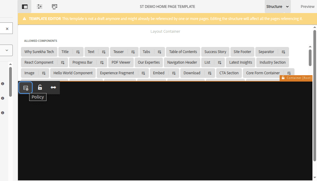
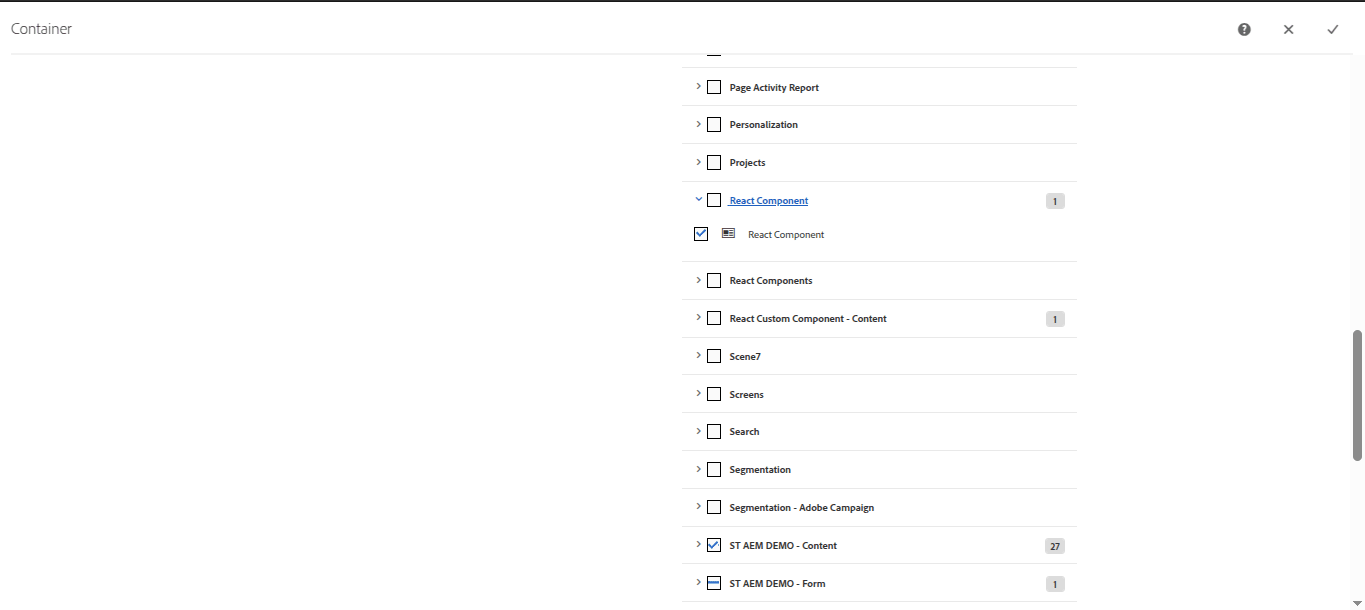
- From the allowed components tab, there will be list of all the components and we need to find our component group which is “React Component" and inside that there will be our component “React Component” we need to enable it.
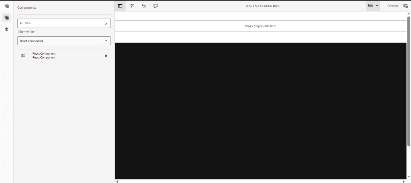
- After that you will be able to see your component in component tree, drag and drop that component in your page.
Output: React Application as Custom Component

Conclusion
Bringing React into AEM 6.5 as a custom component is a great way to modernize your development approach without losing the robust content management features AEM offers. By walking through the steps in this guide, from setting up your project using the AEM SPA archetype to customizing and deploying your “React App” you can build highly interactive and reusable components that improve both development efficiency and user experience.
If you're looking to hire an AEM developer for your project or need AEM support services, SurekhaTech can help with pre-vetted, skilled developers. For more information, please visit the following pages:
[1] https://www.surekhatech.com/hire-aem-developers
[2] https://www.surekhatech.com/aem-development-services
Contact us to schedule a meeting with our team


